I make a lot of event posters. And I’ve noticed something. The posters that bring people in aren’t always the fanciest ones. They’re the clearest ones.
Your poster gets about two seconds in someone’s feed. That’s it. So the job isn’t to say everything. The job is to make someone stop, get it, and remember it.
Here’s what I focus on every time.
Lead with the one thing that matters most
Ask yourself, “What’s the first thing I want people to see?” Usually it’s one of these:
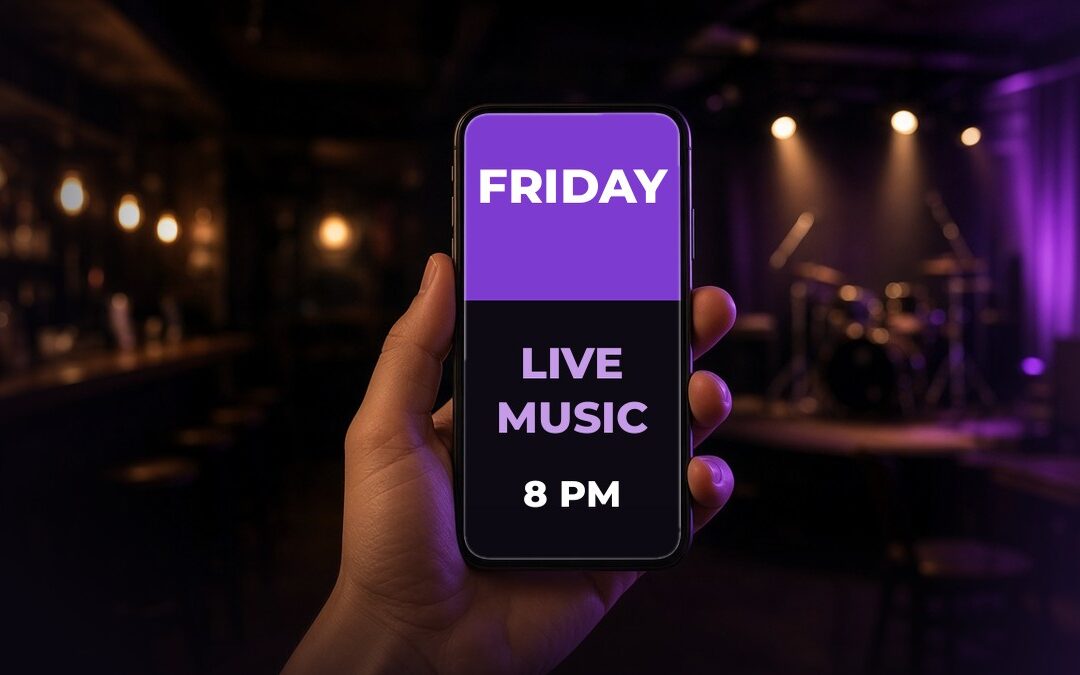
- The day (“TONIGHT” or “FRIDAY”)
- The act or the event name
- The hook (“Live Music + Half-Price Apps”)
Make that one thing big. Everything else gets smaller.
Keep it to the essentials
A poster that works usually has:
- What’s happening
- When (day, date, time)
- Where (your venue or business name)
- One reason to come
Leave the rest for the caption. Lineups, menus, ticket details, and fine print all fit better there.
Design for the phone first
Most people will see your poster on a phone, not on a wall. So:
- Use big, bold text that reads at a glance
- Pick two fonts at most
- Make sure the text stands out from the background
- Keep important stuff away from the very edges, where apps sometimes crop
A quick test is to shrink it down on your phone. If you can still read the day and the act, you’re good.
Use real photos when you can
A great photo of the band, the room, or the food beats generic stock art. People want to see who they’re coming to see and what it feels like to be there.
If the photo is busy, add a simple dark overlay or a solid color block so your text stays readable.
Stay true to your brand, every time
When your posters share the same colors, fonts, and layout week after week, people start to recognize them before they even read them. That’s how a local brand gets built. Not with one perfect poster, but with a lot of consistent ones.
Make a few sizes
One design rarely fits everywhere. Plan for:
- A square or 4:5 version for the feed
- A tall 9:16 version for Stories and Reels
- A print version if you hang posters in the venue or around town
Same look, different shapes.
Add a little motion
A poster with simple animated text or a short clip often grabs more attention in Reels and Stories than a still image. It doesn’t have to be fancy. A few seconds of movement can be enough to stop a scroll.
Don’t forget the caption
The poster gets the attention. The caption closes the deal. Repeat the key details, tag the performers, and add a simple next step like “See you Friday” or “Message us to reserve a table.”
A quick poster checklist
Before you post, run through this:
- Can I read the day and the act in two seconds?
- Is the time on there?
- Is our name or logo on there?
- Does it look like our other posters?
- Is there a tall version for Stories?
Five yeses and you’re ready to go.
Want posters done for you?
This is the heart of Promo Drop. You tell me what’s coming up, and every week I send back posters, animated promos for Reels, and captions ready to post, all true to your brand.
Want to see some samples? Take a look at Promo Drop or send me a message. Let’s talk.